UI/UX Case Study: Thesis Game Revisited
They were right when they say that quality of a released game does not stop post-development. After post-graduation time, I've learned a lot about UI/UX design to understand the flaws in the game's direction on the design. Thus, I've team up once again with my previous teammates to revisit this thesis game and put what I've learn on UI/UX design to practice.
Inverse Matrix Revisit
Inverse Matrix is the tower defense game meant for thesis purposes. This revisit will tackle the design issues based on the feedback from the participants of my group's thesis project.
Role
I am once again assigned as the UI designer of the game production, in addition to the UX designer of the game. My role consists of compiling and summarizing participants' feedback, researching design ideas, and create smooth UI/UX design of the game outside main gameplay. I've been collaborating with the game programmer and designer (Jake and Hans) to create a smooth UI/UX design of the game outside main gameplay.
Problem
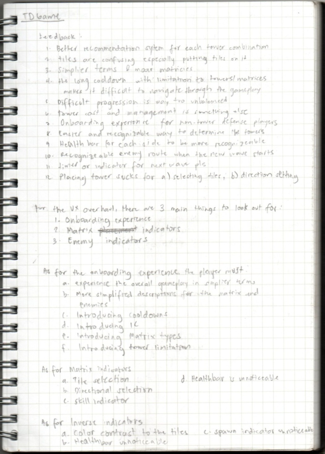
After compiling all the feedback from the participants of my group's thesis, they were two major design flaws that the developers overlooked in favor of time clutch data gathering and its analysis for my group's thesis.
Underwhelming onboarding experience
For players that have no experience on tile-based tower defense game like Arknights, they have a terrible game experience ranging from information overload from tutorial to underwhelming visual information on main gameplay.
Misguided game's design direction
It is the flaw of my UI design choice outside main gameplay due to my lack of knowledge on UI/UX game design, opting to replicate the designs from gacha games like Arknights and Genshin Impact without understanding why it clicks to the players.
Goal
Simplify the game's onboarding experience
This allows the players to feel the simplistic retro style of the game as well as give room for exploring the game outside main gameplay.
This allows the players to feel the simplistic retro style of the game as well as give room for exploring the game outside main gameplay.
Expand the game's Information dump
To allow the players to dissolve the information in a more digestive way outside tutorial section.
Reinforce the game scene's visual layout
To challenge oneself to apply what I've learned on UI/UX design and create a smooth visual appearance that matches to the game's inspiration as well as its theme.
Early Ideation
I started off with sketching how the layout of each game scene would look like after compiling the participants' feedback from google sheet. Using discord voice chat to communicate with two of my former colleagues in thesis game to kick start the revisitation of the game.
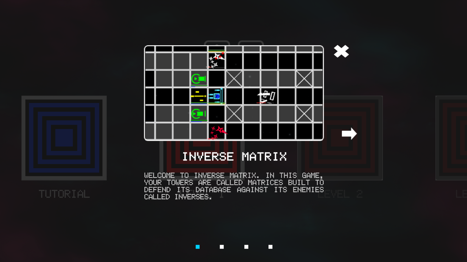
At the end of the session, we established two major features we will re-touch upon, tutorial 2.0 and game scene navigation. Tutorial 2.0 is a must since previous iteration of tutorial section failed to inform the players about the game.
I've been assigned to the game scene navigation re-touch. Although, it wasn't part of the feedback, our discussion upon the design of the game should also need an update. Thus, I started with user flows and Information Architecture to establish each game scene's purpose and its content.
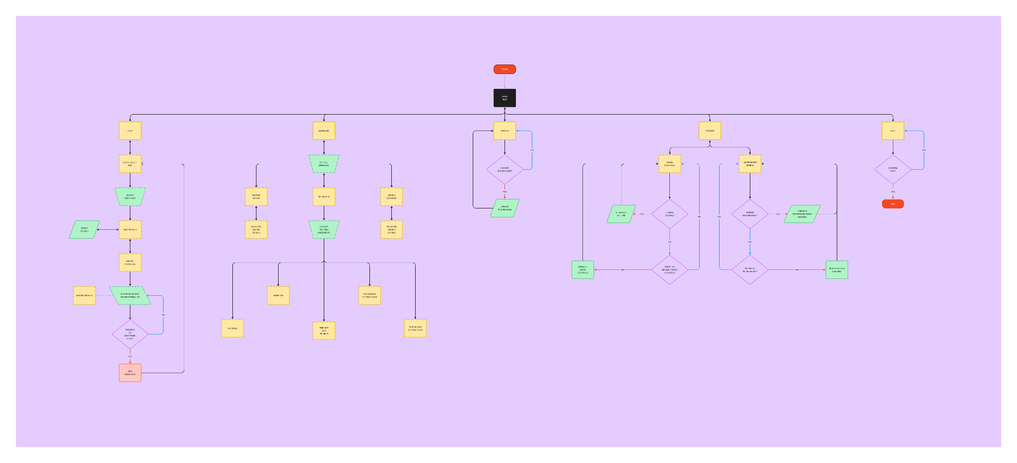
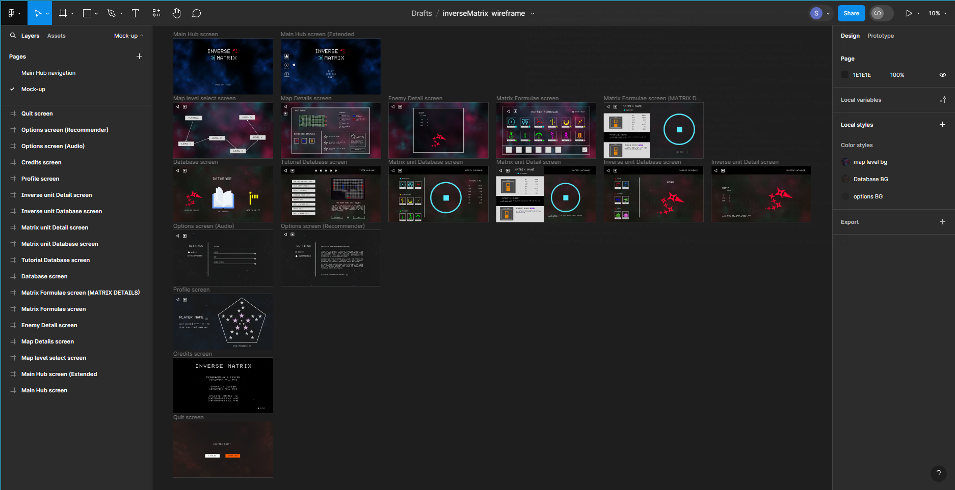
Inverse Matrix user flow
Inverse Matrix Information Architecture
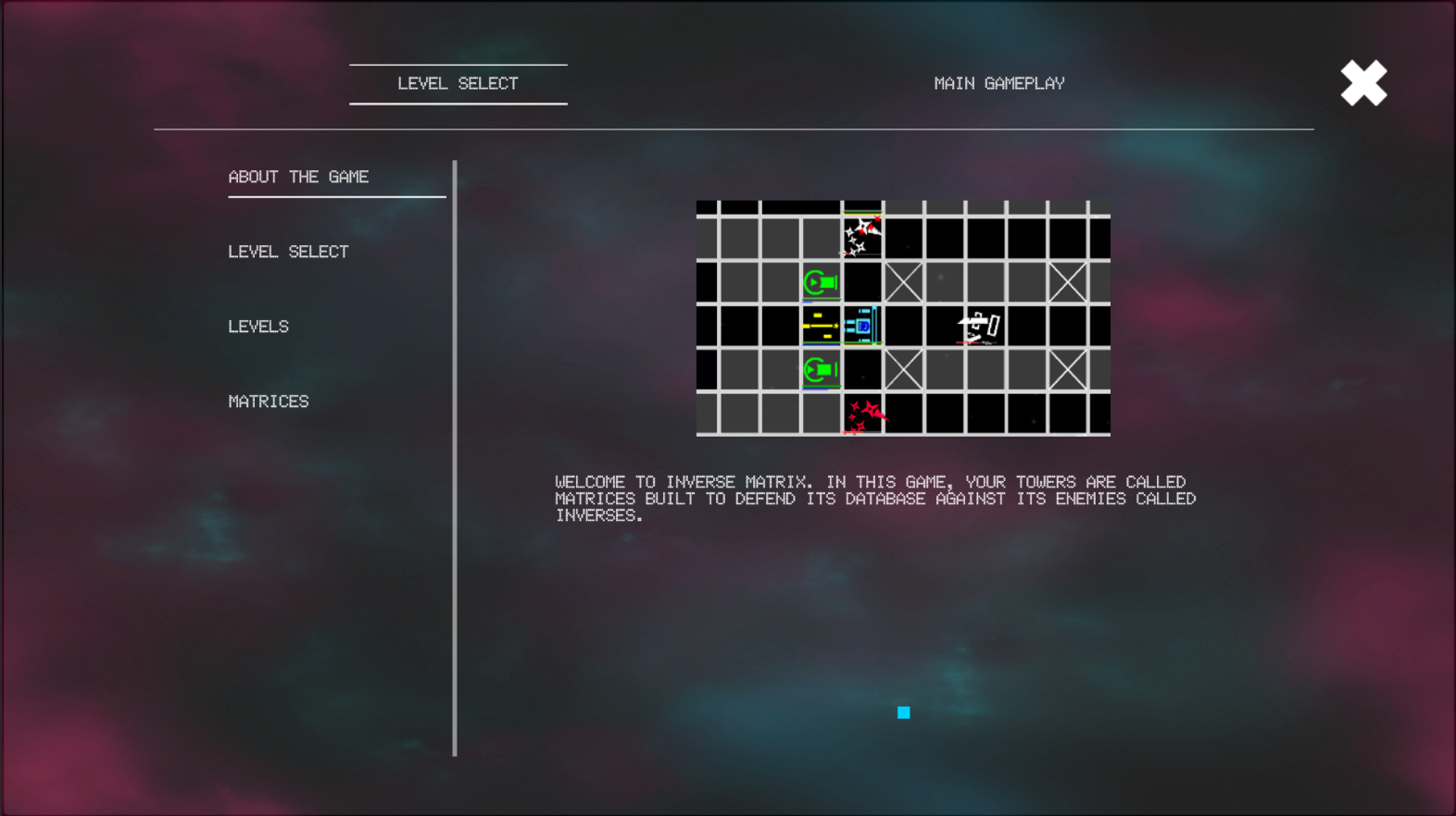
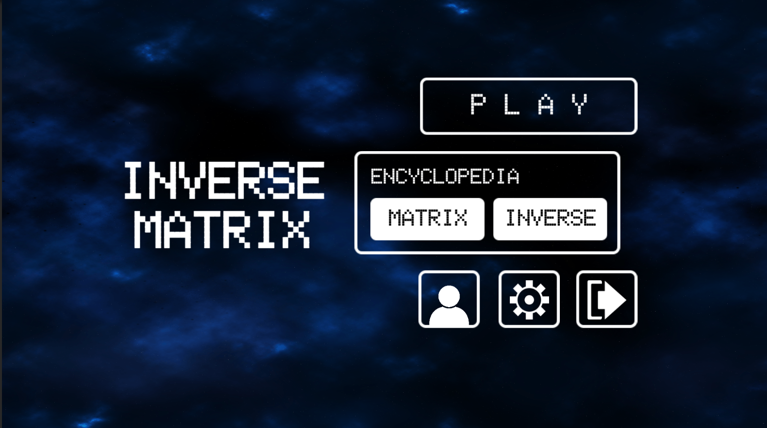
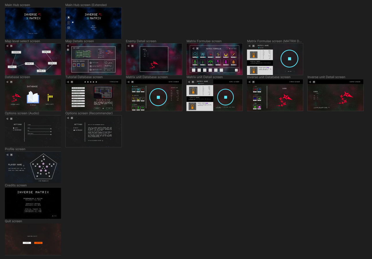
After which, I turned these ideas into low-fidelity wireframes using Figma. The primary goal is to simplify the game scene navigation and how the players will obtain info in a digestive way. I have drawn inspiration once again on the UI designs from Arknights and Genshin Impact with the addition from a game named Reverse: 1999 to create a more cohesive way of navigating through the game.
"Final" Design
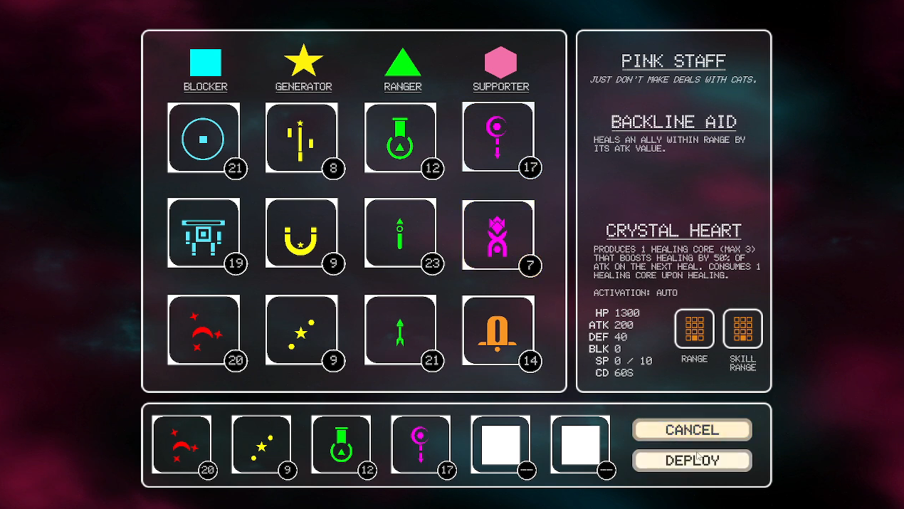
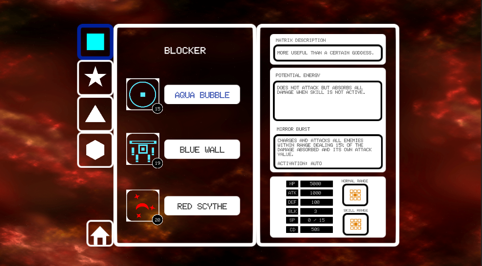
Once the designs from the low-fidelity wireframes were approved. I've added the UI elements used from the game and modify its color values to create the high-fidelity design of each game scenes. Some of the changes include the UI elements for navigating previous scene and main hub which is inspired from Reverse: 1999, while some of the UI elements missing like that of logos from the general tutorial database scene requires collaboration with the game designer to match the ideas meant for each category.
Skipped Design process steps
Although I've given the github permission to apply my designs on the game. I learned that I may have skipped a few steps on UI/UX design process in which I should implement on the next project I'll take.
Design Sprint
Although there was a session kick starting the revisitation of the thesis game, I've failed to initiate a design sprint to draw more of the game designer's design direction.
Design Documentation
Although there isn't much of documentation needed for this game as the game designer pointed out, I should have included it as a means to take note of my previous thought process on the failed design.
Prototyping and User Testing
I have skipped using prototyping on my design knowing that only the developers know the process of game production. However, I should have instilled on creating prototypes so I can test my designs on future users of the game and reiterate my designs to be more polish.
Still under development
As we reached the end of the development, with the tutorial 2.0 being implemented and only waiting for my high-fidelity designs to be implemented. We can still instill on user testing the beta version of the revisited game before we can publish the game for public use.
Post a comment